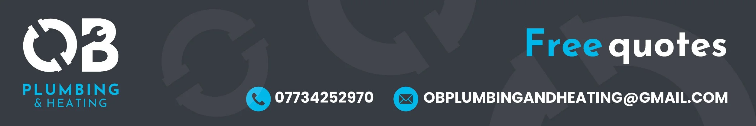
Branding
O’Brien Plumbing
& Heating
Colwyn Bay, North Wales
I created a full brand identity for O’Brien Plumbing & Heating, a Colwyn Bay–based plumbing and heating service. This included designing a modern, memorable logo built around the Director’s initials “OB,” incorporating subtle plumbing tools to clearly reflect their trade.
Alongside the logo, I developed the supporting visual style, colour palette, and promotional assets used across social media and print materials.


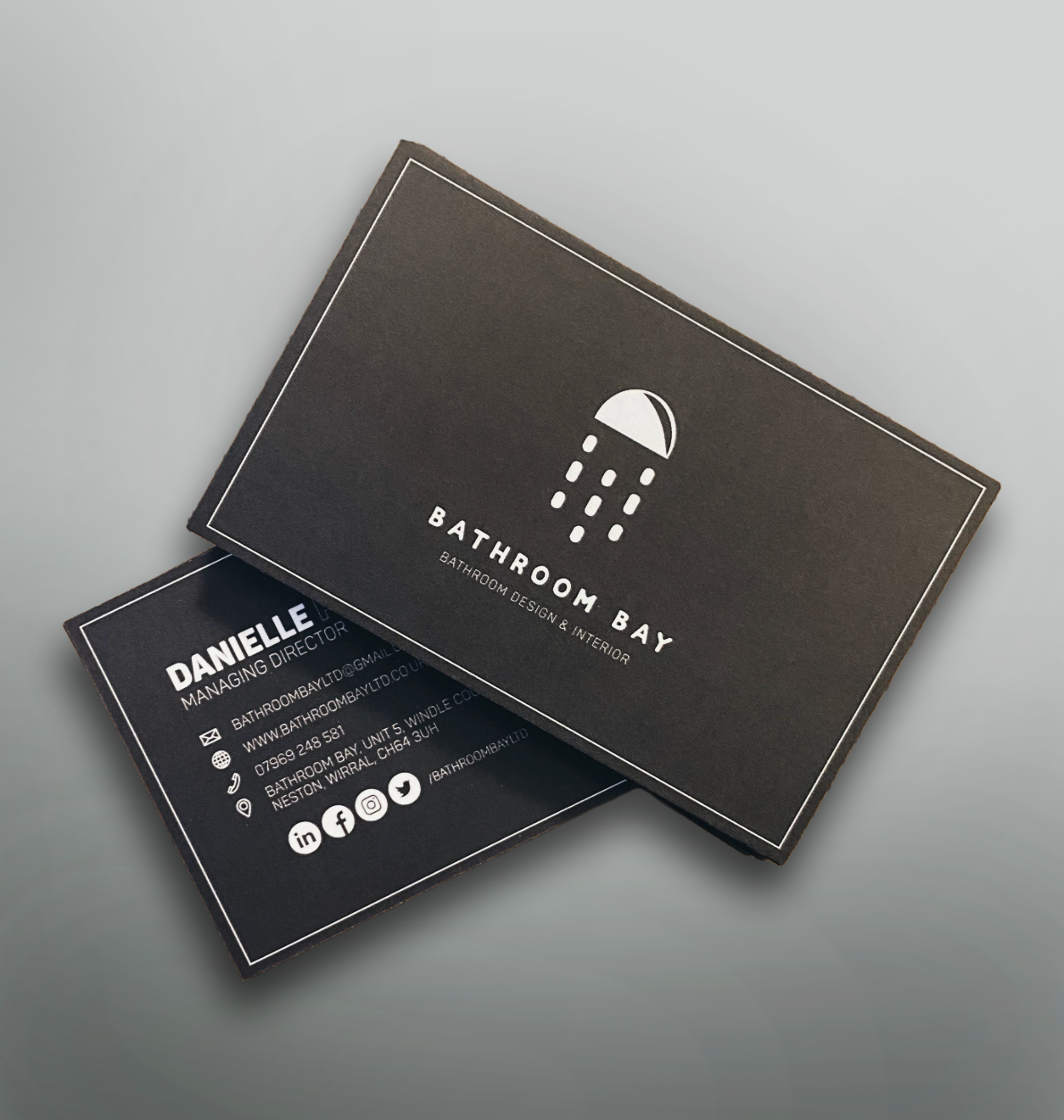
Bathroom Bay LTD
Wirral, UK
Bathroom Bay is a small business that started in Rhyl, North Wales, and is now based in the Wirral.
The business is ran by a team who have a genuine passion for transforming spaces. They believe bathrooms need to be designed specifically for each customer to suit each individuals taste, budget and lifestyle.
I was hired as a freelance designer to design the company a logo and help establish their brand identity.

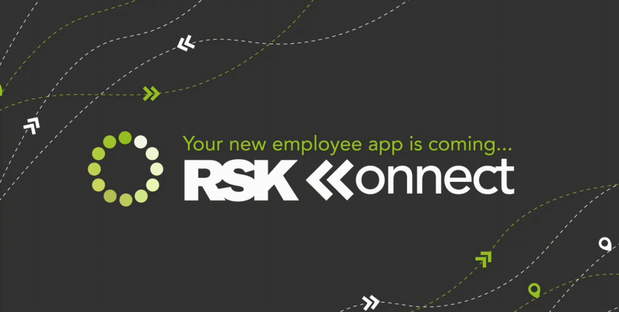
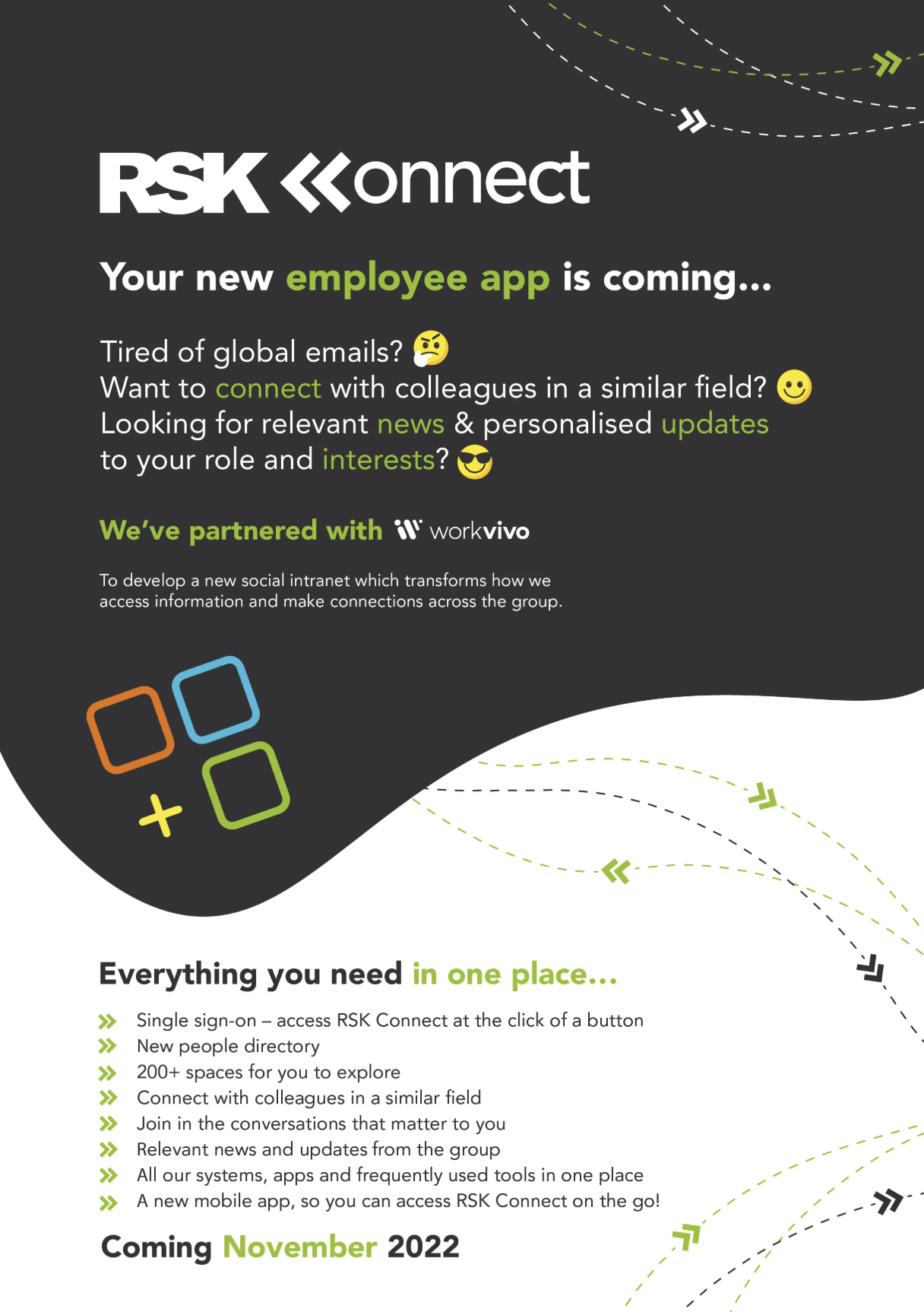
RSK Group
Chester, UK
During my time working for RSK Group, I was tasked to develop a brand for their internal intranet platform, and app.
I designed all branding, visual assets and campaign materials for the launch of the platform.

mmunic Ltd
Chester, UK
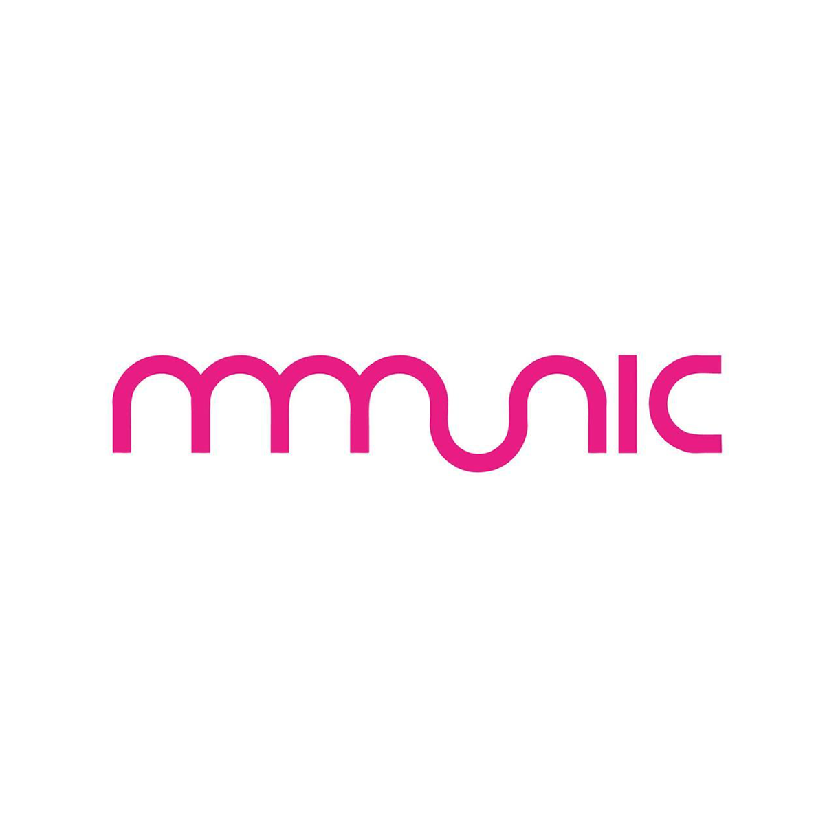
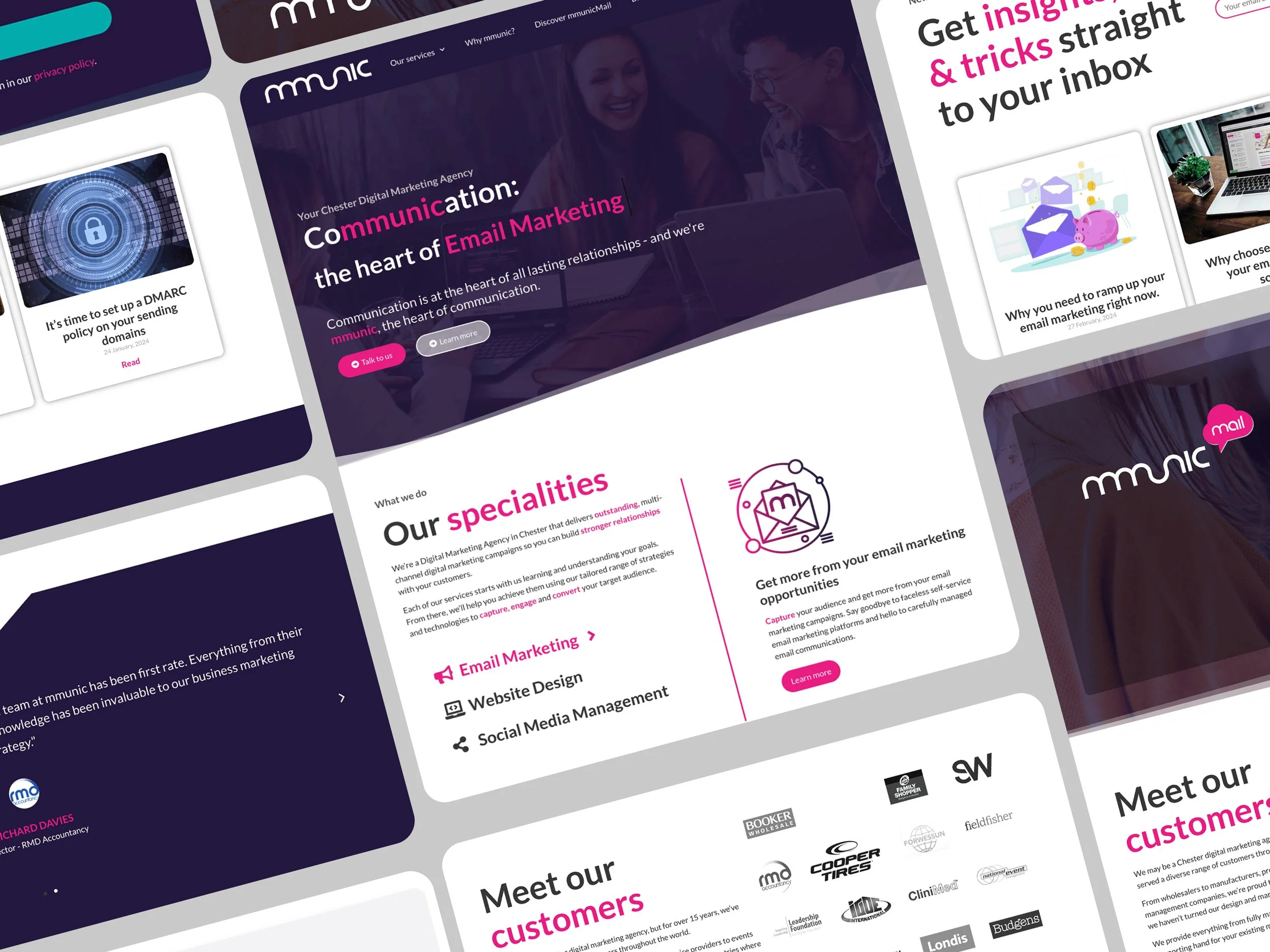
During my employment at mmunic, I suggested we give the brand a bit of a refresh, as I felt it looked and felt a bit outdated.
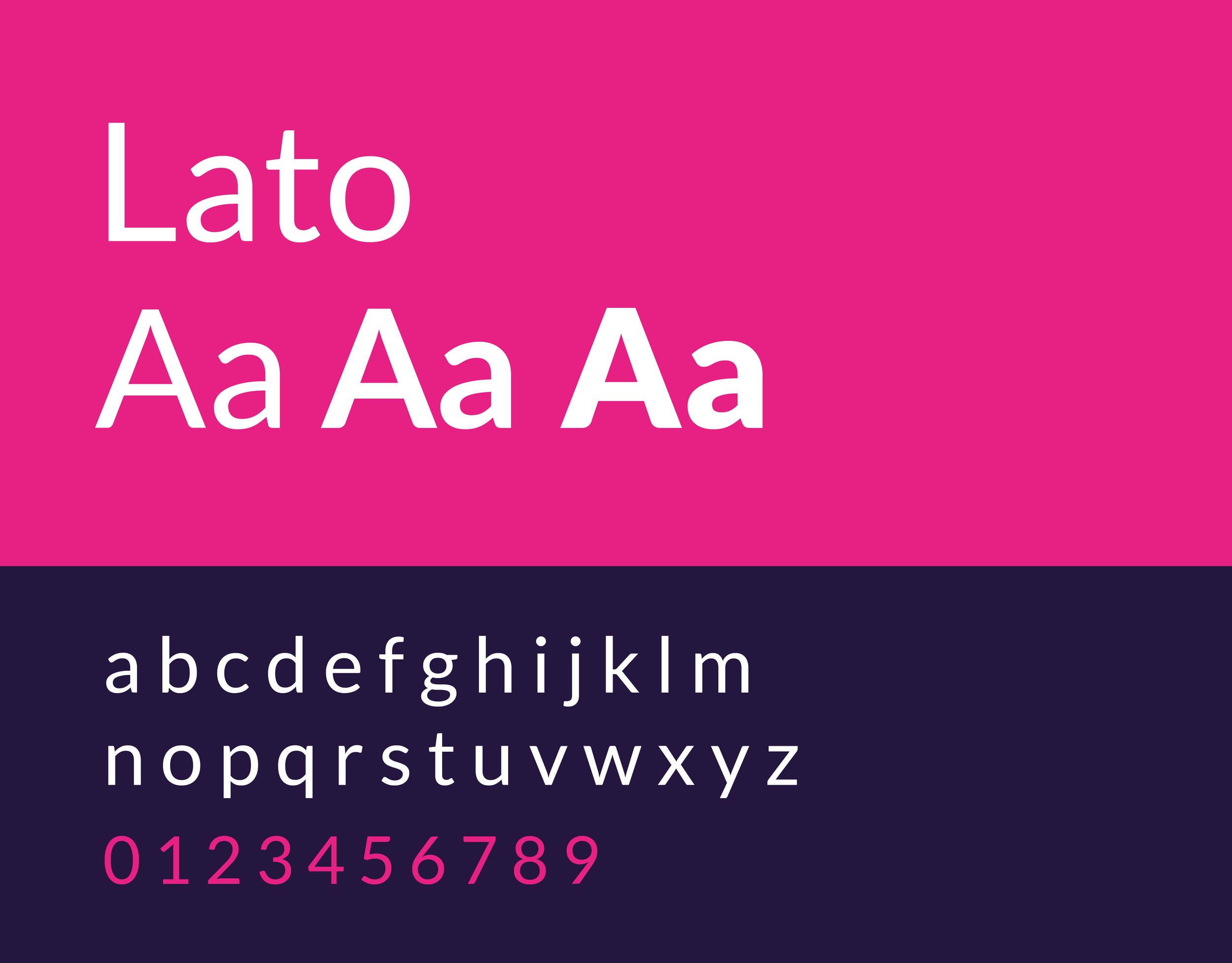
The logo transitioned from a dark, subtle colour to a vibrant, energetic pink. This bold change immediately makes the brand more memorable, passionate, and approachable.
The core "mmunic" wordmark was isolated, removing the tagline and heart from the primary logo lockup for better scalability and visual focus.
The vibrant pink now serves as the Primary Brand Colour, ensuring the new identity is tied to feelings of passion and connection, successfully refreshing the look to reflect the theme: "The Heart of Communication."
Previous
Refreshed
Type One Style
Type One Style make diabetes easier. Their products combine practical protection with a personalised, stylish look, giving users greater comfort and confidence in their daily routines.
For this project, I developed a refreshed brand identity that reflects the company’s blend of function and self-expression.
The goal was to create a visual language that feels modern, inclusive, and empowering—aligning with their mission to make medical devices feel less clinical and more personal.
The final brand system includes updated typography, a refined colour palette, and a flexible graphic style used across packaging, digital assets, and marketing materials.
Kent, UK


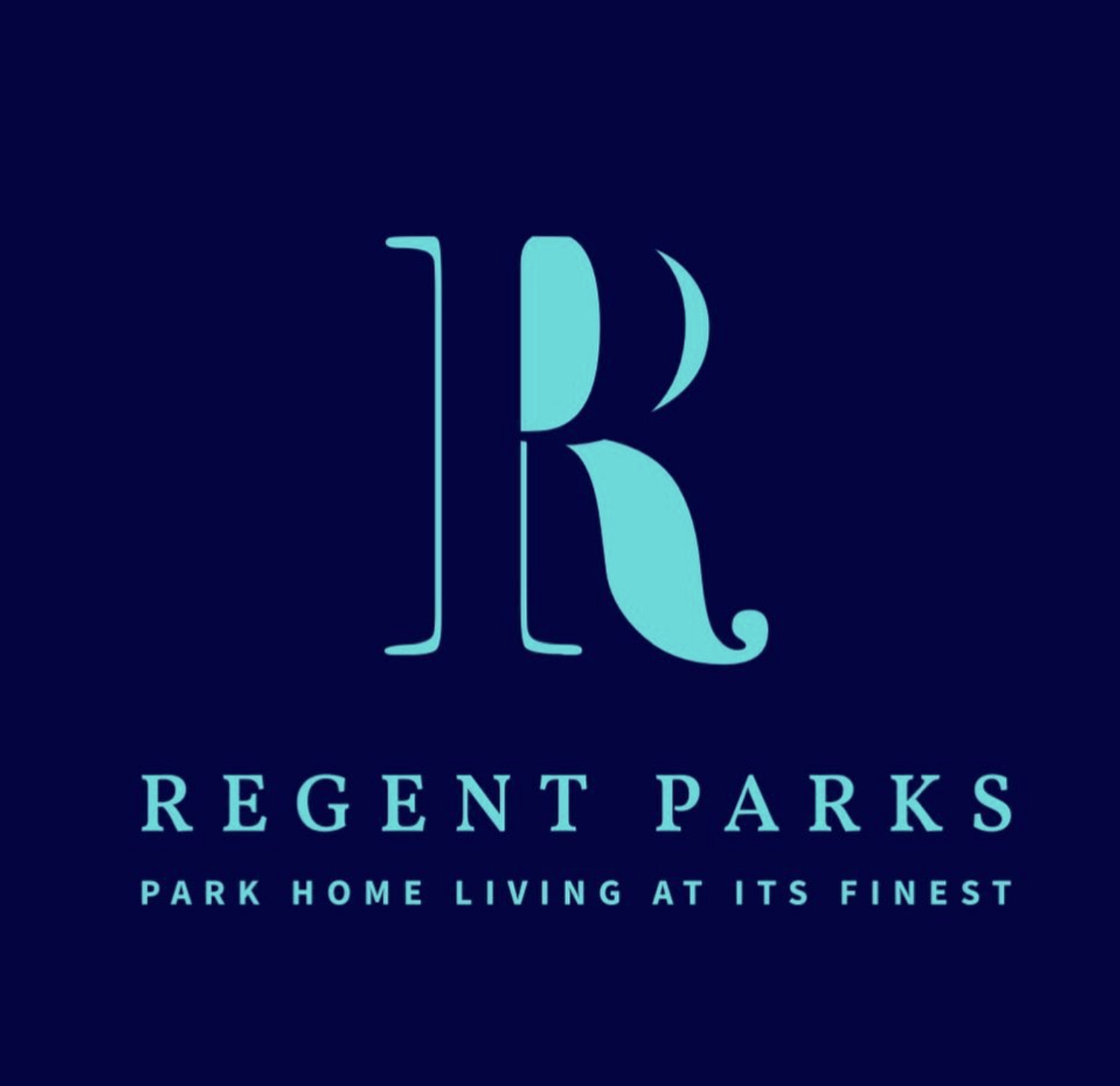
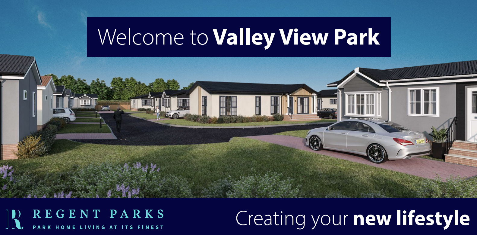
Regent Parks
Cheshire, UK
Regent Parks is a successful growing family business providing luxury residential & holiday parks across the UK for over 20 years.
They requested a brand package to be designed, which was to be used across their website and marketing materials.
I wanted to centre the focus on the company name “Regent Parks,” by presenting a clear, memorable monogram that could be used across signage, marketing, and digital media.

Green Hill Solar Farm
Under my employment with Copper Consultancy, a client requested a brand package to be designed for their solar farm.
The "Green Hill Solar Farm" logo was designed to be simple, organic, and modern.
Graphic: Minimalist, rounded shapes in sage green represent the hills/farm. A simple, solid orange circle represents the sun/solar energy, creating a natural, abstract landscape.
Colour: A limited palette of earthy sage green and warm terracotta enforces the theme of nature, sustainability, and reliability.
Typography: A clean, legible sans-serif typeface supports the minimalist graphic, with a strong hierarchy to emphasise GREEN HILL.
The design uses negative space and geometric simplicity to create a recognizable and professional brand mark.